Jingoistic smugness —
How to ruin your heritage brand
Air New Zealand's recent announcement to paint their rear ends black “because they believe it's the nation’s colour", seems to conclude something I have suspected for a long time, that trendy designers have invaded the board room and completely mesmerized the directors. Convincing them how old-fashioned they are and in need of a new livery to communicate all of their innovations.
I can't imagine the same thing happening in the Burberry boardroom, which has stuck to its piece of tartan since it's begun as a boring raincoat company in 1856. Now the 98th most valuable brand in the world, everyone can spot their identity as a form of visual shorthand. Dr. Ferdinand Porsche would likewise be pleased to know that 50 years apart his company’s design and presentation of the famous 911 sports car hasn't changed much and the logo not at all.
Why is it our airline is so schizophrenic in terms of its design systems, which seem to change so frequently? Perhaps they are confused between campaign advertising and the establishment of a true brand heritage. I suspect the airline may well be captured by its multiple design agencies or indeed worse they don’t seem to talk to each other. Rob Fyfe the outgoing CEO, and John Palmer the chairman were recently whingeing about the government not doing enough to promote New Zealand’s tourism image internationally, in that their long-distance destination business is drying up.
Air New Zealand is currently the only airline, which circumnavigates the globe, an incredibly infectious idea in terms of long haul hospitality. Being the airline which transforms you from the moment you step on board bringing you to a beautiful restful and pure part of the world. Why then are they “ Rugbyising” everything and turning their back on the blue Pacific for inspiration. Brands are not about who you are, but rather how others wish to perceive you. Long-distance travelers crossing the oceans will firstly be engaged through color. From the desk clerk to the aircraft and beyond, the question is what is the best color or sequence of colors to communicate an airline experience within New Zealand and beyond.
Blue is arguably the most popular choice for a brand colour. Blue is thought to put people at ease, as it is reminiscent of the sky and the ocean. Green is synonymous with calm, freshness and health. Deeper greens are associated with affluence, lighter greens with serenity. Black is used by companies that wish to boast a classic sophistication. Black works especially well for expensive products, and of course is the colour of mourning in the Western World. Whilst it might inspire pride in Kiwis, I'm not sure black will do much for women across the world or indeed those that have never heard of rugby. Clearly it works well as a sporting brand. It seems like there is a kind of boyish disregard for the conventions of branding such a national icon as our airline.
The in-flight humor requires a lifetime of living in New Zealand before it's irreverence could be understood by the international traveler. Trelise Cooper’s history in clothing design has always been known for its plagiarized offerings from elsewhere, somewhere between Jane Austen and the belle epoque, like so many designers she's terrified of the national identity. Most women haven't worn cyclamen, or ming blue since they were 5 years old, why then have them grace the aisles like drag queens serving some of the world's best Sauvignon Blanc.
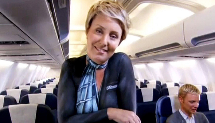
I was sitting next to an American in business class recently who thought the latest pink offering and body painted hostess asking us to buckle up was especially worn as part of a gay Mardi Gras. Hopefully he wasn't from the Midwest. The men's waistcoats, with their Dick Frizzell like graffiti of New Zealand centric words ‘Sweet as!’ ‘G’day’ and ‘blow’ add splendidly to the confusing array of kiwiana.
This is branding from the inside out, as opposed to the outside in. It's a kind of jingoistic smugness that says this is the way we are, and it is seems completely devoid of a beautiful story which people expect of us. As a highly successful airline Air New Zealand has a heritage going back to its Coral Routes and the warmth of the people and the Pacific. It's what the world wants of us in traveling to our shores. And within this country it's what the majority of us want of ourselves.
The Singapore Girl strategy for their national airline turned out to be a very powerful idea since its inception 27 years ago. She has become a successful brand icon with an almost mythical status and aura around her. The Singapore Girl encapsulates Asian values and hospitality, and could be described as caring, warm, gentle, elegant and serene. It is a brilliant personification of SIA's commitment to service and quality excellence. The icon has become so strong that Madame Tussaud's Museum in London started to display the Singapore Girl in 1994 as the first commercial figure ever.
I'm not sure our body painted “Sheila” equivalent with the inimitable nasal accent will be joining the lineup at Madame Tussaud’s for a while yet, and when she does I wonder which hall of fame she’ll feature in.


